This is one of my favourite spaces to share our new branding and website launches, along side some fantastic business information.
How Use Your Logo & Icons To Develop Your Brand Recognition





You’ve opened a business and gone through your marketing checklist. You have a positioning strategy, an awesome web presence, and the perfectly designed set of logos to develop your brand identity. All three of these things work together to create customer awareness and fortify your brand strategy.
Your website features icons and logos which align with your strategy for business. But which ones do you use and where do you place them? It can seem like an overwhelming fear, which is precisely why we wrote this post. Read on, and learn how to implement your brand new branding assets within your business correctly.
What are the Icons/Logos?
In essence, these are images that represent your company. They summarise what you offer and entice your audience to seek your services. Your business has many faces – from social media to physical advertising – so it is essential to have more than one logo. Typically, a proper set includes:
- Main logo or primary image: This is your main brand image. It is a bold mixture of colours, icons and fonts which communicates the essence of your brand.
- A variation on your logo: Simply a tweak on your main logo, this icon features minor rearrangements in colour or pattern.
- Submark image for your logo: A toned-down version of your main logo, the submark feature is a subtler version of your main image usually in the form of an icon.
- Pattern or element: While not every company has a pattern, they are often used to tie imagery in with the logo itself. For instance, if you run a surfing business with iconic waves in the back of your logo, the pattern could appear as those recognisable waves.
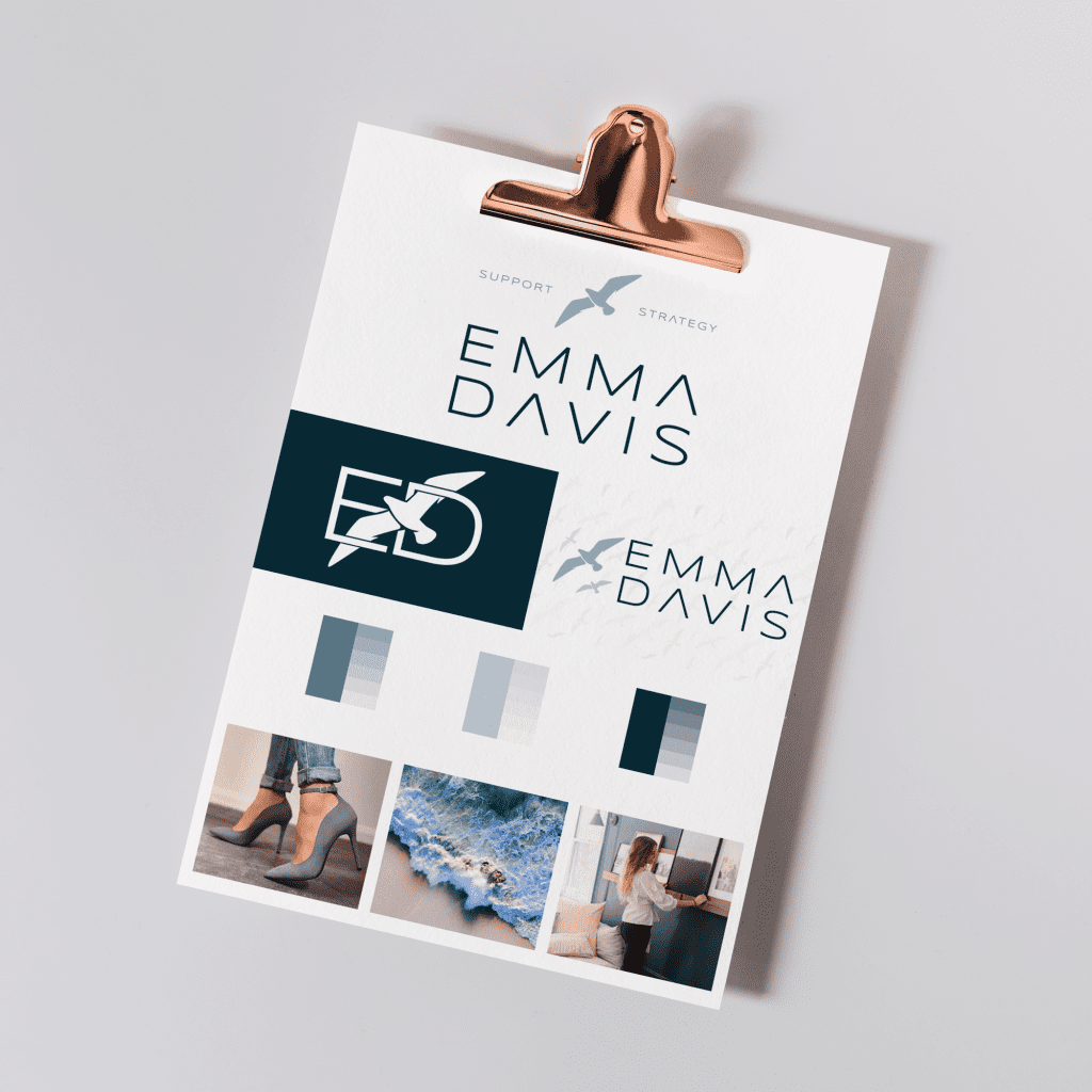
Here you can see the asset for Emma Davis. The main logo that includes her icon design and tagline, her alternate logo, which fits into a longer shape with her birds to the left, and her icon design. If you look closely, you will also see that her alternate logo is displayed with her repeat pattern faintly in the background.
How To Use These Features
Images are at their most valuable when you use them properly. Here is a quick breakdown of the best times to use each type of logo design:
- Main Logo: Employ this feature prominently on your website, social media page, email signatures, stationery, and business cards. Especially in the early stages of business, it is crucial for your customers to be able to see this icon clearly. This way they can associate it with your company.
- Logo Variation: Use this logo when printing dimensions restrict you from your main logo. If you have a black and white option, you can place this logo to cut down on printing costs. Since it is so similar to your main logo, this image will also tie to your business in the eyes of consumers.
- Submark: When you have already used your main logo or its variant, this mark lets you reinforce brand identity without overdoing it. A more subtle way to grow your brand, this works well on headers and footers, as a watermark, or on individual social media posts. Choose this when your main logo is somewhere nearby so you the viewer doesn’t grow immune to your message.
- Element: Once you have developed a baseline of brand identity, you can use your element to reinforce your message. Sometimes, c used in the place of a submark, and other times, it goes in the place of your logo variation. As your brand and logo adapt, the element can tether your first version to later evolutions.
Branding Used Well
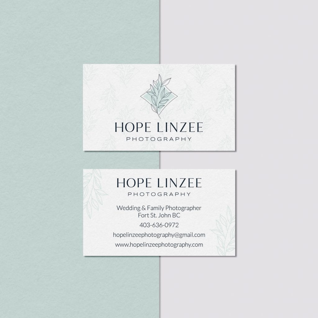
The branding for Hope Linzee Photography is an excellent example of this. We have the main logo on the front centre of the website and the front of the business cards. However, on the website menu and the back of the business cards, we have her alternate logo. A variation that does not include her icon. We also have her repeat pattern leaf detailing very faintly in the background of her business card and her website. Completely tying her brand together and making it recognisable no matter from where you are approaching.
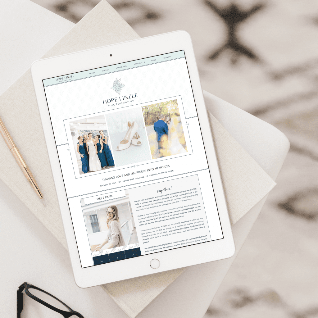
Imagery is the key to developing brand identity. In an increasingly visual world, it is essential to create meaningful pictures to connect with your audience. Logos provide an excellent opportunity to communicate your desired message quickly. After all, a picture speaks a thousand words. So, what will your logo say?
Want to work with us to create a fantastic brand identity? Click here



Leave a Reply
Free, takes about half an hour, and you can leave the list whenever you like.
37 words and phrases that give AI copy away, plus the twenty minute fix for the most important line on your site.
August 5th, 2023 at 7:05 am
[…] brand logo represents your online business, so it should look professionally done. Thankfully, there are loads […]
August 26th, 2024 at 1:16 pm
Fantastic advice on using icons and logos to enhance your brand! Visual elements play a crucial role in brand identity, and these tips can help create a memorable and effective visual presence.
January 29th, 2026 at 6:18 am
This post is such a clear, confidence-boosting guide for using logos and submarks intentionally instead of just sprinkling them everywhere.
May 22nd, 2026 at 9:20 pm
Most people overcomplicate the submark stuff, but it really just comes down to having something clean that fits in a square avatar. Keeping the branding consistent across social media is way harder than it looks though.
May 24th, 2026 at 8:07 pm
Most people skip the submark step, but it’s basically necessary if you want your profile pics to actually look good.
May 25th, 2026 at 4:41 pm
most people forget about the submark but it’s basically essential for favicons and social profiles
May 25th, 2026 at 4:43 pm
People really overcomplicate the submark thing, but having a simplified icon for mobile makes way more sense than cramming a full logo onto a small screen. Glad you mentioned that part.
May 25th, 2026 at 4:49 pm
submarks are a lifesaver for favicons. otherwise the main logo just looks like a blurry blob
May 25th, 2026 at 4:58 pm
Submarks are a total lifesaver. Most people just try to shrink their main logo for social media icons and it looks terrible.
May 30th, 2026 at 6:11 pm
honestly submarks are the most underrated part of this. saves you from having a cluttered profile pic