Hudson Yoga Project
Table of Contents
ToggleSharing is caring!
Reading Time: 3 minutes
“The website now feels like an extension of our brand and our studio and the entire process was such a gift.” – Kate Lombardo
And breathe… There is something strangely soothing about putting together a website for a yoga studio.
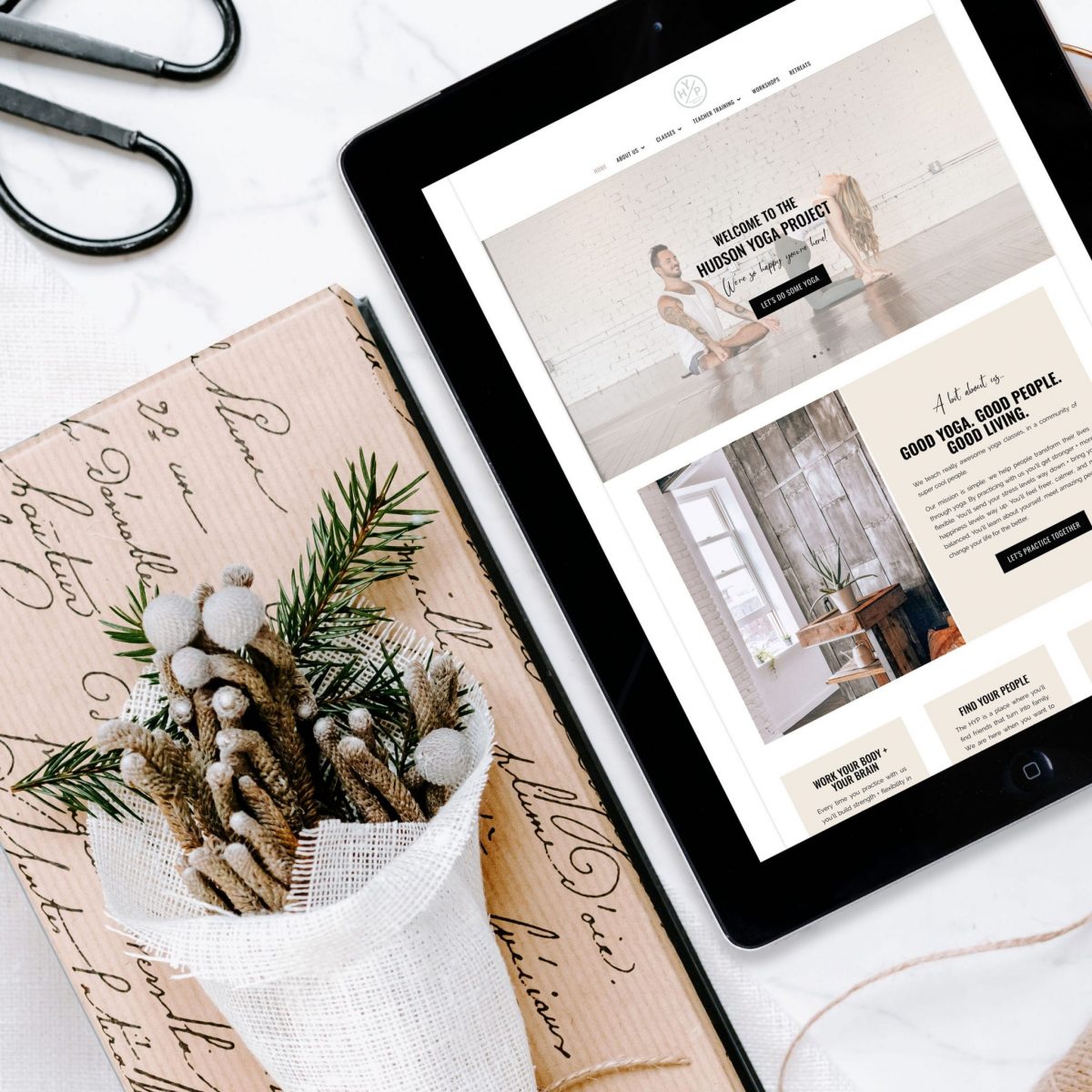
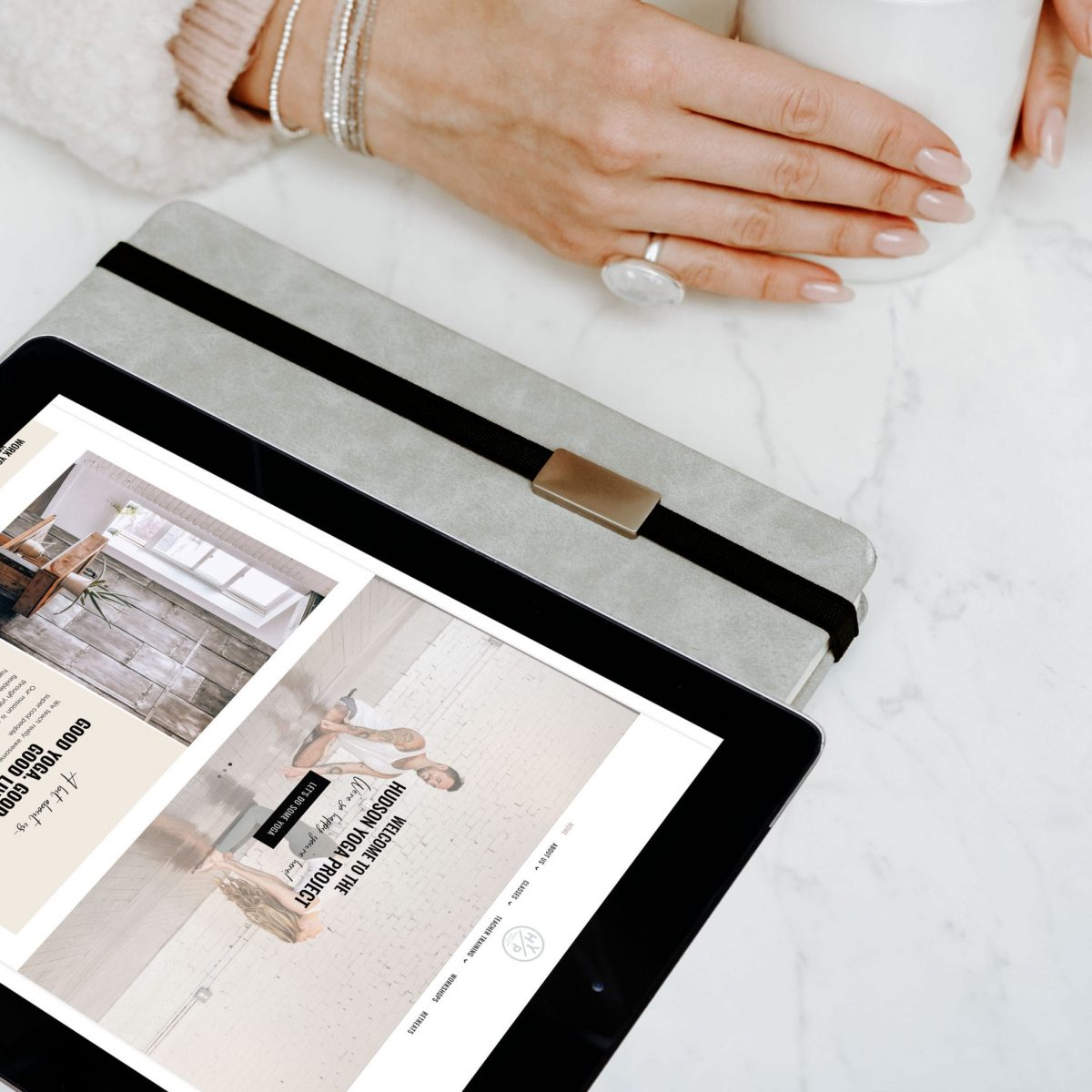
I've been working closely with Kate Lombardo, co-owner for the Hudson Yoga Project, a yoga studio located in New Jersey, to create their new website. Kate wanted to take one of our fantastic WordPress themes and make a few customisations for her project. We started with a copy of “The Bobbi”, and we added in her branding colours and fonts, changed the structure around a little bit, and created a few custom modules.
We then created and added in a membership area to the website, so all of her existing studio members can learn and practice from home. Now the Hudson Yoga Project have everything they need to take their studio online and serve members who may not be local to their area.

VIEW THE HUSDON YOGA PROJECT WEBSITE HERE
Tell me a bit about your business and what brought you to start it in the first place?
The Hudson Yoga Project is a yoga studio + lifestyle brand based in Hoboken, New Jersey. We lead vinyasa + yin yoga classes, workshops, and teacher trainings along with running online courses and selling ebooks. Our mission is simple: we help people transform their lives through yoga.
What is one lesson that you wish you knew from the beginning?
That it's ok to price our services for what they're truly worth and that discounting them doesn't help anyone. I think when we first opened we were so eager to have anyone come, that we were willing to price our classes at a lower price point than they should have been. We've adjusted, but still have members paying the lower prices which is a challenge that is hard to overcome after the fact.
What was your “AH-HA” moment that made you take the plunge into this business?
I quit my “full time” job as a high school teacher almost 4 years ago. Ever since I've been doing a ton of different things– all freelance, along with teaching yoga. Last year I was consulting on SEO and digital marketing for the studio I taught at and it finally hit me that the studio needed someone with my skills on an ownership level, and I needed to spend my energy doing something I loved everyday. I decided to pitch it to my now business partner, and it all worked out from there.
Out of all the amazing designers out there, why did you decide to work with us?
I found you through Etsy actually when I was looking for a template for my personal website. After purchasing one for my own site, and seeing not only how beautiful the theme was but also how easy it was to edit/navigate, I knew you were the designers I wanted to work with when it came to the redesign of our business website. I also really loved how customisable your packages were and feel great that you offer additional services that I may return to for the future.
What was your favourite part of the design process?
I enjoyed the whole process to be honest. Working with you was such a breath of fresh air. Full disclosure– my business partner had actually paid for a website redesign a few months before I came on board. The whole site was so so difficult to edit and I really hated the way it looked. We had the exact opposite experience with you. The website now feels like an extension of our brand and our studio and the entire process was such a gift.
Want to work with us? Check out our services page and get in touch!
Most Popular Posts:
Sharing is caring!
Hi, always i used to check website posts here in the early hours in the morning, for the reason that i like to gain knowledge of more and more.