This is one of my favourite spaces to share our new branding and website launches, along side some fantastic business information.
I Built My Newsletter Template in Flodesk Studio: An Honest Designer’s Review

Quick note before we start: Flodesk gave me early access to Studio while it is in beta. This is my honest take on it, written the way I write everything here. Where I loved it I have said so, and where it caught me out I have said that too.
If you have been around here a while, you will know I spend my days building websites and brands for small businesses. What you might not know is that I also run a lifestyle blog called My Life From Home. It is my own little corner of the internet away from client work, and every Sunday I send a newsletter from it called the Sunday Letter.
I mention it because that blog turned out to be the perfect place to test something new. I needed a proper newsletter template for the Sunday Letter, and rather than build one the way I usually would, I decided to build it in Flodesk Studio and see whether it was any good.
Short version: it is. I loved it. But you are not here for the short version, so let me walk you through the whole thing, the parts that impressed me and the couple of things I wish I had known before I started.
First, some context on why I was interested at all.
We are all living through a strange moment with these tools. Everything launching right now seems to want to do the work for you. Write your emails for you, plan your content for you, generate, generate, generate. And the result, more often than not, is that everything starts to look and sound the same. Flat. A bit hollow. You can usually feel when something was made by a machine that has never met the person it is supposedly speaking for.
As a designer, that worries me more than most, because the whole point of what I do is to make things feel like you. So I approached Studio with a healthy dose of suspicion. What changed my mind is that it is not really one of those tools at all.
First, what is Flodesk Studio?
Flodesk Studio is a brand-new email design app, and I want to describe it carefully, because the lazy shorthand would be “an AI email tool” and that does not quite capture it.
Here is the cleanest way I can put it. Studio is built by real human designers, accelerated by AI, and finished by you. You describe what you want. Studio brings it to life, on-brand, in seconds. Then you refine it, either by talking to it in plain language or by getting in and moving things around yourself. You can use it inside Flodesk, or you can export the HTML and send it from another provider entirely.
So it is not a co-pilot hovering over your shoulder offering to take the work off your hands. It is a studio. A room to make things in.
And right now, while it is in beta, it is completely free. I will come back to that, because I know it is the first question a lot of you will have.
Why it actually feels different
Most of the new tools I have tried this year start from the same quiet assumption: that the goal is to remove you from the process. Less you, more machine. Studio starts from the opposite place.
The whole thing sits on a foundation that real designers built by hand. The layouts, the type, the spacing, the way a block of text breathes on a page. That craft is baked in before AI touches anything. So when you write a prompt and Studio generates a starting point, it is not conjuring something soulless out of nowhere. It is arranging genuinely well-designed pieces around your idea.
There is a line Flodesk uses that stuck with me, because it gets right to the heart of it. The reason a Studio email looks like a real designer touched it is simple. One did.
That is the whole philosophy in a sentence. The AI is the accelerator, not the artist. It gets you moving quickly. It does not decide who you are. As someone who makes a living from taste and craft, that is the distinction that made me actually want to use it.
The experiment: building the Sunday Letter template
The only real way to judge one of these tools is to use it on something that matters, so I set out to build a proper, reusable template for the MLFH Sunday Letter from scratch.
I started with a prompt. This is usually where these tools give themselves away, where you type something hopeful and get back something generic. So I was deliberate about it. Rather than feed it a mood, I gave it a job. Here is roughly what I asked for:
Design an email newsletter for “The Sunday Letter”, a personal weekly reflection from a UK lifestyle brand called My Life From Home. The reader should feel they have been handed a quiet, considered letter, not sent a marketing email.
Structure, top to bottom: a small understated masthead with the newsletter name; a warm personal greeting to open; a main reading section with room for several paragraphs of writing; a pulled-out quote given space to breathe; a short “noticing this week” section for two or three small things I am loving; a personal sign-off with a bio block; a minimal footer.
Aesthetic: editorial and calm, closer to a printed magazine column than a promotional email. Generous white space and wide margins. Modern serif headings with a clear size jump between heading and body so the hierarchy is obvious. A soft, warm, muted palette. Use grain-textured block-cards rather than flat solid colour, for warmth and a slightly nostalgic, tactile feel. One or two small stickers placed casually and rotated a few degrees off-straight, never centred and rigid.
Keep the whole layout unhurried and understated. No hard sell, no loud buttons, no countdown timers or urgency. This is a letter, not a campaign.
Then I waited for the disappointment. It did not come.

The first thing Studio does is interesting. It does not hand you one answer and call it finished. It spins up three directions off a single prompt: a visual version, a banner version, and a plain-text version. Three takes on the same brief, so you can see the letter dressed three different ways before you commit. The rough estimate is that this gets you about 80% of the way there, and that feels about right. It is not the finished article. It is the hard, blank-page part of the finished article, handed to you in seconds.
From there, the room is yours, and this is the part I loved most.

I refined it by chatting to it in plain words, the way I would brief another designer. Make the headings bigger. Soften that background. Give the quote more room. And when I wanted to be precise, I dropped into the manual builder and moved things by hand.
A few things genuinely delighted me. The block-card styles are lovely: you get solid, grain, and blur, and the grain in particular gives you that slightly nostalgic, editorial texture that flat colour never will. The stickers are a small joy, because you can drag them anywhere and rotate them freely, so nothing sits in that rigid, locked-to-a-grid way that makes templated emails look templated. And the blocks cover the things a real newsletter needs. There is a Quote block, a Personal bio block, a Content block for the writing itself, and plenty more. For a reflective letter like mine, it was the quiet, personal ones that earned their place, and I happily left the louder, more salesy blocks alone.
So, the verdict. I loved it, and the thing that won me over was how flexible it is. The prompt got me most of the way, then it let me steer from there in whatever way suited me, whether that was a quick instruction in chat or getting my hands in and nudging things pixel by pixel. Nothing felt locked. It bent to what I wanted rather than making me bend to it, which is not something I can say about most template builders.

A few honest notes, because this is a review and not an advert
I would not be doing my job if I did not tell you the bits that caught me out. None of them are dealbreakers. All of them are worth knowing before you start, so you can skip the small learning curve I did not.
The big one: build the whole thing in Studio. All of it. Your real text, your real links, everything. I made the mistake of treating Studio purely as a design tool and assuming I would tidy up the words and drop my links in once the template landed in Flodesk. You cannot. Once a Studio design is in Flodesk, you cannot edit it there. Every change means going back into Studio and pulling it through again. So finish your copy and add your links while you are still in Studio, and you will save yourself all the back-and-forth I created for myself.
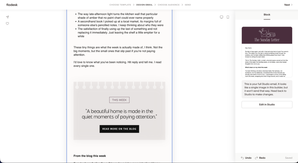
That same thing showed up again when I went to reuse the template. After I sent the first email, I duplicated it to write the following week’s Sunday Letter, the way I always do in Flodesk. But because the design lives in Studio, I had to head back there to make my edits rather than just editing the duplicate. Once you know it, it is simple. You just start thinking of Studio as the source file and Flodesk as the outbox, and the workflow makes sense.
And one small thing to watch. When my design first came through to Flodesk, it had dropped my background colour. A two-second fix once I spotted it, but exactly the kind of thing you would miss if you were not looking. Give your email a quick once-over after it lands, just to be safe.
Worth remembering that Studio is in beta and they are shipping updates constantly, so some of this may well be smoother by the time you read this. Forms and pages are on the way too. But as things stand today, that is the honest workflow, and knowing it up front makes the whole thing painless.
Design here, send anywhere
There is one feature I want to put a spotlight on, because it quietly solves a problem I hear from small business owners all the time.
Plenty of you do not use Flodesk to send your emails. You are on Mailchimp, or Kit, or Constant Contact, or something else. And the usual version of that message is: I love how Flodesk emails look, but I am like my current setup.
Studio undoes that knot. Whatever you build can be exported as clean HTML, which means you can design a properly considered email in Studio and then send it from wherever you already are. You are not switching platforms or migrating your list. You are borrowing the design room and taking the finished email home with you.
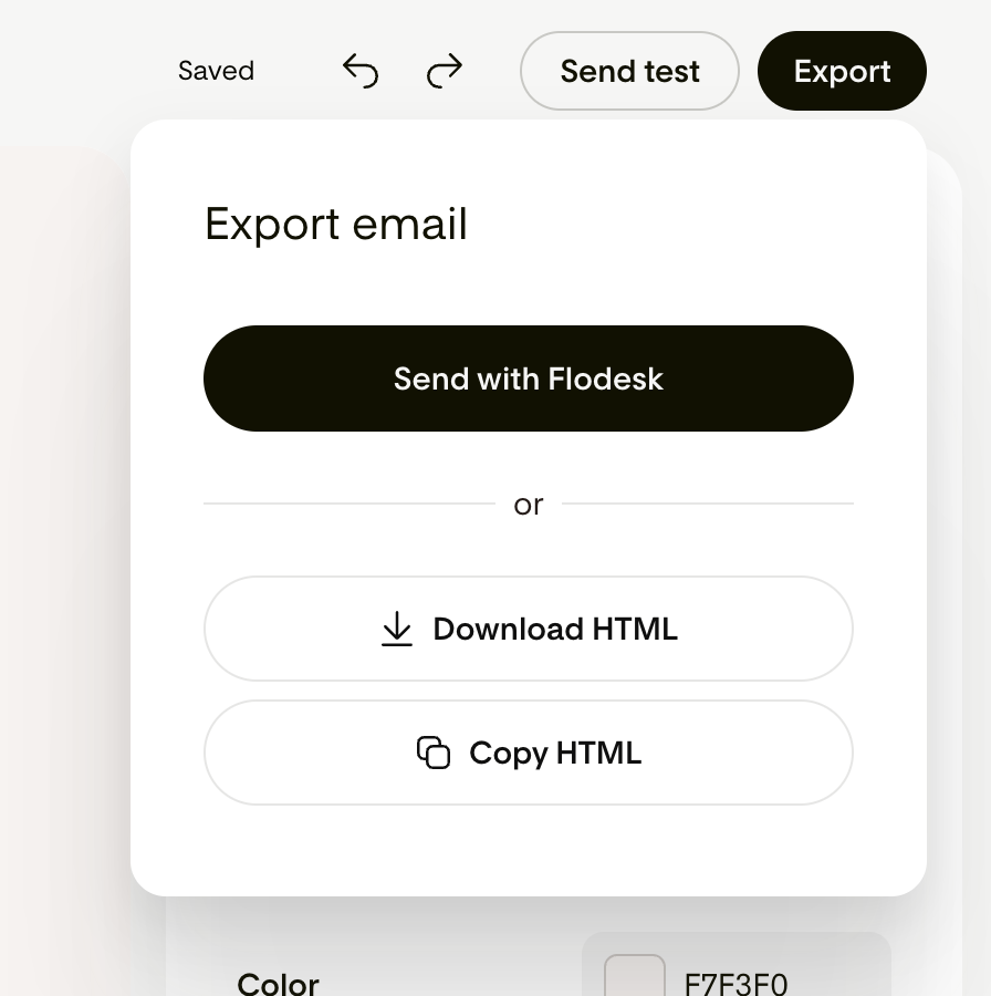
So if you have ever searched for beautiful email templates for Mailchimp, or tried to make a custom HTML email that does not look like it was built in 2009, this is a genuinely useful answer. Design here, send anywhere. Just remember, as I learned above, that the design still lives in Studio, so that is where you go back to when you want to change it.
The bits I keep coming back to
I do not want to turn this into a spec sheet, but a handful of small things have quietly made my work easier and deserve a mention.
It remembers my brand properly. The exact colours, the fonts, all the details I have historically had to re-enter every single time. Studio stores that, so everything I make stays consistent without me babysitting it. If you have ever pasted the same hex code in for the hundredth time, you will understand the small, specific relief of this.
It saves real time. The blank-page part of building an email, the part that used to eat an evening, now takes about as long as a cup of tea. As someone who charges by the hour for exactly this kind of work, I do not say that lightly.
It comes with brands ready to go. If you have not built out a full brand yet, Studio includes pre-made ones to start from, so you are not staring at a void wondering where to begin. You get to look polished long before you feel ready, which is quietly powerful for anyone earlier in their journey.
And it is being built in public, with the people who use it. New things are shipping constantly, which is rather nice to watch. It is email only for now, with forms, pages, and more apparently on the way soon.
So, who is it actually for?
I am wary of telling anyone that a tool is for everyone, because nothing is.
But I think Studio is worth your time if you care about how your emails look but do not want to lose your evenings fiddling with them. If you have ever felt the gap between how good your message is and how plain it ends up looking in the inbox. And especially if you have been quietly resisting this whole AI moment because everything it produces feels hollow, and you have been waiting for something that respects the part of the work that is actually yours.
It is not a machine to write your emails for you. If that is what you want, this is not it, and I would gently suggest you do not want that anyway. It is a well-built room to make things in. The taste is baked in. The speed is baked in. The voice and the heart, the reason anyone opens your emails in the first place, that part stays exactly where it belongs. With you.
A few honest answers
Yes, while it is in beta. No catch that I have found.
I do not know, and neither do they yet. They are using the beta period to figure that out, which I would rather hear than a made-up number.
No. It works best inside Flodesk, but you can export the HTML and send from any provider that supports it.
Not at the moment. Edits happen back in Studio, so treat Studio as your source file and do your full build, text and links included, before you pull it through.
Your turn
If any of this has made you curious, the best thing you can do is go and play with it on something you are actually working on. Not read about it. Use it. Throw in a prompt and see what comes back.
Start creating today, free while it is in beta, at studio.flodesk.com.
Leave a Reply
Free, takes about half an hour, and you can leave the list whenever you like.
37 words and phrases that give AI copy away, plus the twenty minute fix for the most important line on your site.
PLEASE COMMENT BELOW