This is one of my favourite spaces to share our new branding and website launches, along side some fantastic business information.
Best Practices for Mobile-Responsive Design on Showit

In today’s digital landscape, having a mobile-responsive website is not just an option—it’s essential. With the majority of web traffic coming from mobile devices, designers and content creators must prioritise mobile-friendly design to ensure a seamless user experience. For users of Showit, a popular web design platform known for its drag-and-drop interface and high customisability, creating a mobile-responsive site comes with unique opportunities and challenges. This article delves into best practices for mobile-responsive design specifically tailored for Showit users, helping you avoid common pitfalls and enhance your site’s mobile usability.
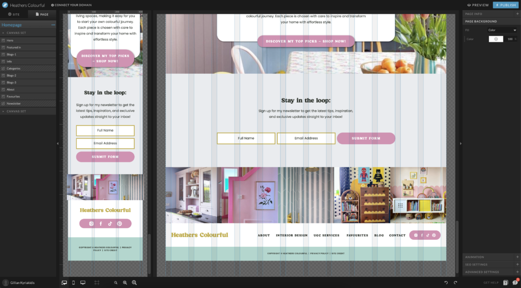
Understanding Mobile Responsiveness on Showit
Before diving into the best practices, it’s crucial to understand what mobile responsiveness entails within the Showit context. Showit offers distinct desktop and mobile versions of your site, allowing unparalleled control over how content is displayed across devices. This dual canvas approach means you can optimize every element for mobile without compromises.
Key Benefits of Mobile-Responsive Design
- Improved User Experience: Mobile responsiveness ensures that visitors accessing your site from mobile devices have an experience optimized for their screen size and orientation.
- Enhanced SEO: Search engines like Google prioritize mobile-friendly websites in their rankings, especially after the mobile-first indexing update.
- Higher Conversion Rates: A mobile-optimized site can lead to higher engagement and conversion rates, as users are more likely to interact with a site that functions well on their devices.
Best Practices for Designing on Showit:
Start with Mobile in Mind
Strategic Planning
When beginning your design in Showit, think mobile-first. This approach ensures that you consider how each element will function on smaller screens from the outset, reducing the need for extensive adjustments later.
Simplify Navigation
On mobile, screen real estate is limited. Design a simple, intuitive navigation menu that makes it easy for users to explore your site. Consider using a hamburger menu to conserve space and maintain a clean layout.
Optimise Content for Mobile
Concise Messaging
Mobile users seek information quickly. Keep text content brief and to the point, breaking up large blocks of text into more digestible chunks.
Touch-Friendly Design
Ensure that all buttons and clickable elements are sized appropriately for touch interaction. The average finger pad is 10mm wide, so aim for clickable elements that are at least 48 pixels in size.
Utilise Responsive Images
Showit allows you to set different images for desktop and mobile. Take advantage of this feature by choosing images that are visually effective and load quickly on mobile devices.
Prioritise Speed and Performance
Compress Images
Since images can significantly impact load times, ensure they are optimized for the web. Use compression tools to reduce file sizes without sacrificing quality.
Minimise Use of Heavy Scripts
While Showit supports various integrations and custom code, be mindful of adding scripts that may slow down your mobile site. Prioritize essential functionalities and always test the impact on mobile performance.
Test Across Devices and Browsers
Regular Testing
Continuously test your Showit site on various devices and browsers to ensure consistency in performance and design. Pay attention to how elements appear and interact on different screen sizes.
Utilise Emulators
Use device emulators in development tools like Chrome DevTools to simulate how your site will look on different devices, helping you make adjustments in real time.
Avoid Common Pitfalls
Overlooking Mobile SEO
While Showit excels in design flexibility, don’t neglect mobile SEO. Ensure that all SEO best practices are applied in the mobile version of your site, including proper tag usage and mobile-specific keywords.
Ignoring Load Times
Never assume speed is not an issue on mobile. Regularly check your site’s load time, especially after making significant design updates or adding new content.
Conclusion
Designing a mobile-responsive website in Showit does not have to be daunting. By adopting a mobile-first approach, optimising content and interactions for mobile users, and continuously testing your site, you can create a Showit website that not only looks great but also performs excellently on all devices. Remember, the goal is to provide a stellar user experience that engages visitors and drives conversions, regardless of how they access your site.
And if you’d rather not sweat the breakpoints yourself, my Showit design services cover the whole build — desktop and mobile — tested across devices before it goes live.
Leave a Reply
Free, takes about half an hour, and you can leave the list whenever you like.
37 words and phrases that give AI copy away, plus the twenty minute fix for the most important line on your site.
PLEASE COMMENT BELOW