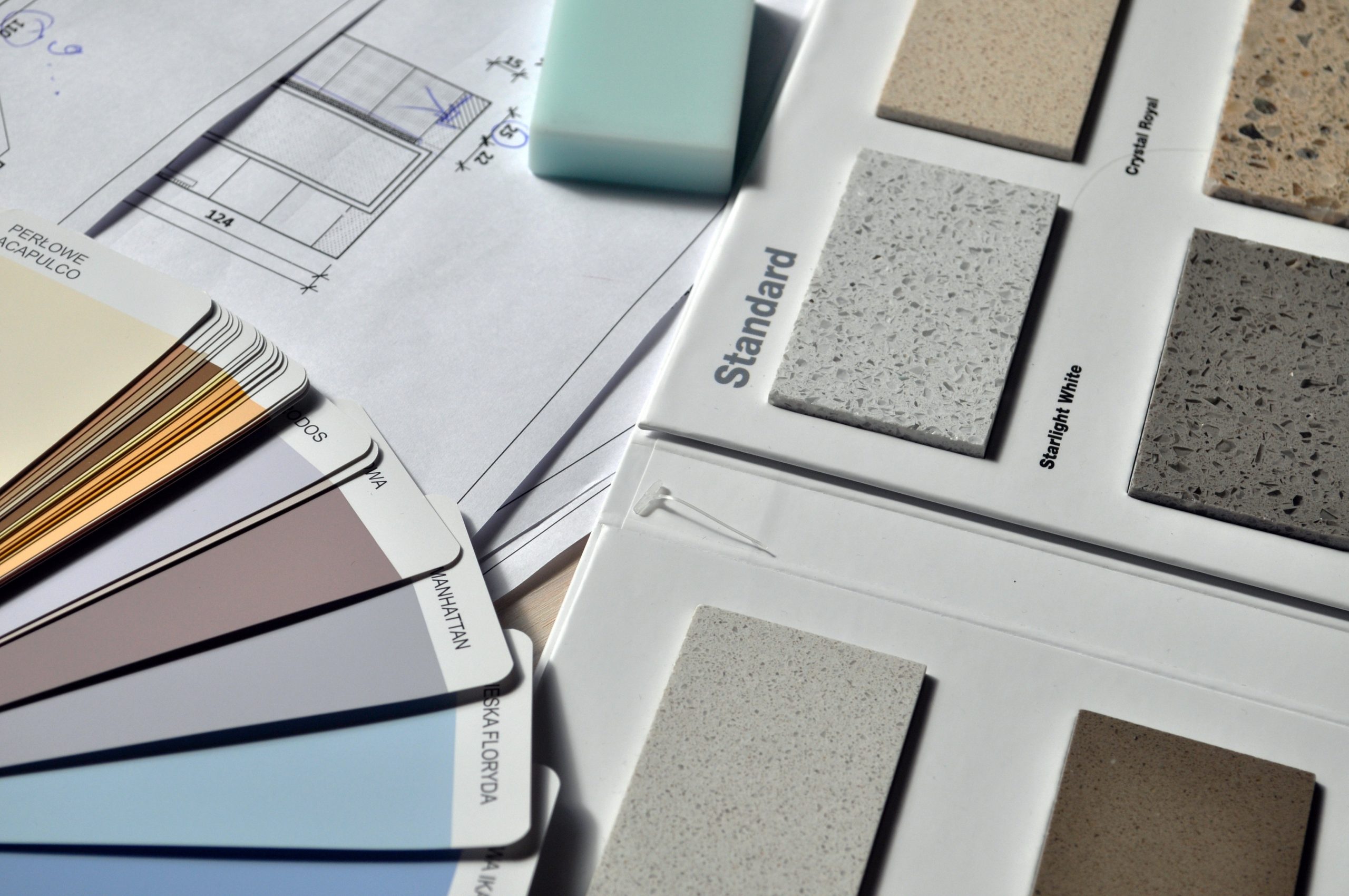
A Rainbow of Possibilities: How Colour Can Impact Your Website
Table of Contents
ToggleSharing is caring!
Reading Time: 3 minutesYour website is critical to how you communicate yourself. When it comes to the variety of components associated with a website, there are an infinite number of possibilities to ensure that you communicate your business and your brand. Colour is one of those things that is something that many may not necessarily consider having a major impact, but colours truly matter. Let's show you how colour can impact your websites in more ways than one, and how you can make smarter design decisions based on your choice of colour.

The Meanings Associated With Colour
On a primitive level, there are many meanings associated with the most common colours. Colour psychology dictates that something like red stimulates the senses because it is associated with anger, and blue is something that's incredibly calming, but when it comes to the variety of colours on offer, you can use the right types of tones to help with the type of products you are pushing.
Take, for example, the colour white. White is associated with things like simplicity, purity, and cleanliness. For example, this website for Richard Haworth’s table napkins uses the white colour scheme because of the colour of the napkins, but also the background is tailored to match it. When you choose a product, you have to choose the right colours and the meanings behind them.
How You Can Get More From Your Colour Schemes
When you are making changes to your website, if you are considering revamping your entire colour scheme, you may want to think twice, rather than completely overhauling everything just to stimulate somebody’s subconscious. Here are a few things that you should bear in mind when it comes to promoting your products in light of certain colour schemes.
Complementing the Colour Scheme
The existing colour scheme may be working in a certain way, but if you don't get a good feeling from the colours, possibly because they're too harsh or they don't communicate the type of brand you want to convey, don't necessarily throw it all out and start again, but instead, you can combine colours to make for a far better feel. For example, if you use the colour blue, you can accentuate the positivity associated with other colours like yellow.
Suggesting Changes
If you think the design scheme doesn't work and you have spent time with website designers, you should feel inclined to speak up when something doesn't work. For example, there will be times when the logo just doesn't cut it.
A logo that has been in place for your business for many years could benefit from rejigging, especially if people are suggesting you change the colour schemes. It will be a mishmash of aesthetics that, very simply, will not work because it only serves to make the website look cheaper and therefore inferior.
Don’t Go Overboard With Your Colour Schemes
Simplicity is critical, and if you think that to start stimulating people in certain ways, you've got to have the colours of the rainbow on every single page, you've got to “keep it simple stupid!” The best way to do this is to reign in the colour scheme with some consistency.
White backgrounds are reliable and will ensure that you are able to stick to a simple palette of colours. This is a way of thinking that should permeate the entire website. The cardinal sin many people make when they are upgrading their website is that they need to throw the kitchen sink at it. There are things that will make a massive difference, for example, when you use photography and make upgrades to the quality of the images, but as with any website, if you put too much imagery and too much colour to go with it, you are not conveying a very strict code that makes life easier for the customer. Remember, it's all about the user experience.
Remember: Think About Conversions
Working with a designer means they'll give you input with relation to things like aesthetics and what colours go well together, but at the end of the day, you need something that is going to convert. You need to have a colour bible that shows that can convert people, especially if you are operating within specific industries, for example, if you are trying to communicate a more environmentally friendly approach, green is a very commonly used colour, and black is associated with elegance and luxury, but you may also want to think about your call to actions and your headers. The contrast can be very effective.
There is a rainbow of possibilities with your website, and some of these will make a significant difference.
Most Popular Posts:
Sharing is caring!
PLEASE COMMENT BELOW