NU


Why Everyone Is Obsessed with Bento Grids in Web Design Right Now
If you are a blogger, content creator, or designer trying to keep your website fresh and exciting, there is one trend you need to know about this year: Bento Grids. They are fun, flexible, and basically taking over modern web design in 2025.
In this post, I am going to break down what Bento Grids actually are, why everyone is loving them, and how you can use them to make your own site feel more organized, stylish, and scroll-stopping.
Let’s jump in.

So, what exactly is a Bento Grid?
Picture a Japanese bento box for a second. Everything has its own neat little space; a spot for sushi, a spot for rice, a spot for veggies, all laid out perfectly, but still feeling part of a whole.
That is the vibe of a Bento Grid layout for websites. Instead of one big block of content or endless scrolling, your site is divided into different sections or blocks. Each block can hold something unique: a photo, a blog post preview, a video, a call-to-action, you name it.
The best part? It keeps everything looking clean and intentional while letting your creativity shine through.
Why Bento Grids are Having a Moment
There are a few really good reasons why Bento Grids are popping up everywhere right now.
They Make Your Website Feel Instantly Organized
You know that satisfying feeling when you open a super tidy closet? That is what a good Bento Grid does for your website. Visitors can easily find what they are looking for without feeling overwhelmed or lost.
They Let You Tell a Better Story
Instead of just listing things top to bottom, Bento Grids help you map out a story. Maybe one section introduces your latest project, the next teases a blog post, and the next shares a client testimonial. You are taking people on a journey just by how you lay things out.
They Are Made for Mobile
Let’s be real, if your site is not mobile-friendly, you are in trouble. Luckily, Bento Grids look amazing on phones. The blocks stack naturally, making everything easy to tap, scroll, and enjoy without weird cropping or tiny text.
They Add Fun Without the Clutter
Every block can have its own little personality. Maybe a photo zooms when you hover, maybe a button wiggles slightly when clicked. These small interactions make your site feel alive without being overwhelming.
They Hit That Sweet Spot Between Creative and Clean
Designers love to play, but users want structure. Bento Grids let you have both: a site that feels fresh and different without confusing anyone.
How to Design a Bento Grid That Actually Works
Thinking about giving it a try? Here are a few simple tips to make sure your Bento Grid looks intentional (and not like a random patchwork quilt).
Start With a Plan
Before you jump into designing, sketch out what you want to include. What are your top goals for this page? What content needs the most attention? Knowing your priorities makes it way easier to build a grid that makes sense.
Mix Up Your Block Sizes
One of the secrets to a gorgeous Bento Grid? Playing with different block sizes. Highlight important stuff (like your newest blog post) with a big block, and tuck smaller, supporting things into smaller sections.
Keep Spacing Consistent
Nothing ruins a great grid faster than messy spacing. Keep margins and padding between blocks consistent so everything feels connected, even if the content inside the blocks is totally different.
Show Off Different Kinds of Content
Bento Grids are awesome for mixing it up. You can feature a blog post next to a video next to a photo gallery. It keeps things interesting and lets visitors explore without getting bored.
Make Sure It’s Accessible
This is important. Always make sure text is easy to read, clickable areas are big enough, and images have alt text for screen readers. A gorgeous site is even better when it is welcoming to everyone.
Bento Grids in Action: Some Inspiring Examples
Need a little visual inspo? Here are some brands totally nailing the Bento Grid look.
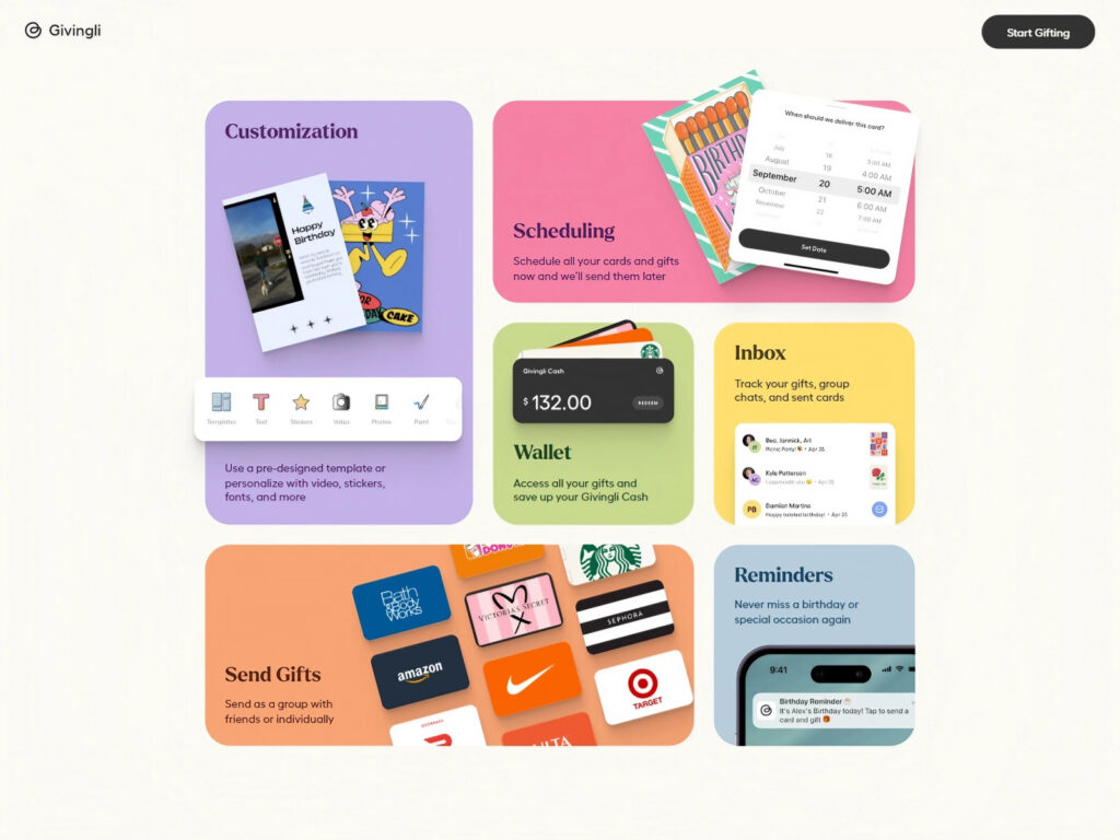
Givingli
Givingli’s website is a masterclass in playful Bento Grid design. Different sections show off products, call-to-actions, and categories in a way that feels super intuitive and fun to explore.
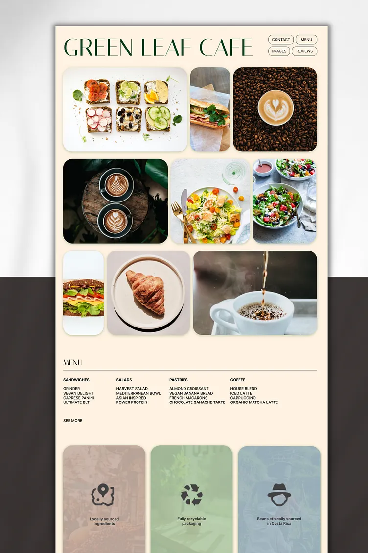
Miranda McKinney’s Cafe Bento Concept
This design is simple, stunning, and proof that Bento Grids do not have to be busy. It is the perfect vibe for lifestyle brands, cafes, or anyone who loves a more minimal aesthetic.
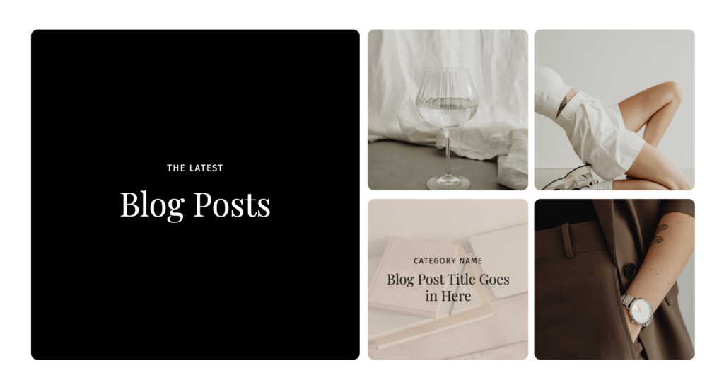
The Canvas Builder
The Canvas Builder offers a beautiful and strategic use of a Bento Grid layout to showcase recent blog posts. Instead of a traditional blog feed, it uses modular, visually balanced blocks to highlight categories, post titles, and eye-catching imagery. This structure makes it incredibly easy for readers to discover content intuitively while maintaining a clean, modern aesthetic. The Canvas Builder is a perfect example of how bloggers and content creators can use Bento Grids to make their sites feel fresh, editorial, and highly navigable.
Each of these examples shows how flexible Bento Grids can be across industries and site types.
Why Bento Grids Are Also Great for SEO
Good news: using a Bento layout is not just pretty, it is smart for search engines too.
When you organize your content into sections, it is way easier for Google to crawl and understand your page. Plus, Bento Grids naturally encourage things like internal linking, clean code, and fast loading speeds, all things that boost your SEO rankings.
Also, the better the experience your visitors have (especially on mobile), the more likely they are to stick around, which tells Google your site is worth ranking higher.
A Few Mistakes to Avoid
Before you dive in, keep an eye out for a couple of common pitfalls.
Overloading on effects
A few hover effects are cute. Too many animations slow down your site and drive people away. Keep it simple and fast.
Trying to cram too much in
Less is more with Bento Grids. Pick your most important content and give it room to breathe.
Forgetting hierarchy
Not all blocks are created equal. Make sure your biggest and boldest areas highlight your most important content.
Neglecting mobile
Test, test, test your design on different screen sizes. A grid that looks great on desktop could be a hot mess on a phone if you are not careful.
How You Can Start Using Bento Grids Today
If you are ready to give your site a fresh look, here are a few easy ways to start using Bento Grids:
- Add a modular featured section to your homepage that highlights blog posts, services, or projects
- Redesign your blog feed using different sized blocks instead of one long list
- Build a new portfolio page that mixes images, testimonials, and service details in a clean grid
- If you use Showit, WordPress, or Squarespace, you can find templates or design kits that already use Bento layouts to make things even easier
And if you want a shortcut to a beautiful Bento Grid setup, check out The Canvas Builder, which makes it super simple to create gorgeous, modern layouts for bloggers and content creators.
Should You Jump on the Bento Grid Trend?
Honestly? If you want your website to feel fresh, user-friendly, and totally on-trend for 2025, Bento Grids are a no-brainer.
They make it easier to tell your story, showcase your content, and keep visitors exploring longer. Plus, they just look really, really good.
So whether you are revamping your site or building something new, give the Bento Grid layout a try. Your visitors (and your SEO rankings) will thank you.

PLEASE COMMENT BELOW