This is one of my favourite spaces to share our new branding and website launches, along side some fantastic business information.
Free Media Kit Templates: Why Your Media Kit Belongs on Your Website, Not in a PDF
Quick answer: A website media kit is a page on your own site that holds your stats, audience details, past collaborations and contact form. Because brands open a link rather than a file, they always see your current numbers. This post covers why that beats a PDF, what to include, and gives you three free Showit media kit templates to start from.
Picture this. You send a brand your media kit in January. It’s a lovely PDF, freshly exported, with your follower count and engagement rate looking great.
In July, that same brand forwards it to a colleague. Or digs it out of their inbox for a budget meeting. Or opens it again because they finally have a slot for your campaign.
Your numbers have changed. Your rates have changed. Maybe you’ve worked with three new brands since then. But the PDF hasn’t moved an inch, so the person deciding whether to work with you is looking at a version of you that’s six months old.
That’s the problem with PDF media kits. And it’s why I’m a big fan of building yours straight into your website.
The problem with sending a PDF media kit
A PDF is a snapshot. The moment you export it, it starts going out of date.
Every time your stats shift, you have to open the design file, update the numbers, export again, and remember to send the new one to everyone who has the old one. Realistically, you won’t. Nobody does. So old versions pile up in inboxes, shared drives and forwarded threads, each one telling a slightly different story about you.
There’s also the practical side. PDFs can be heavy, awkward to open on a phone, and impossible to improve once they’re in someone else’s hands. You’ve got no idea whether they opened it, and no way to fix a typo you spotted five minutes after hitting send.
What a website media kit does differently
A website media kit lives at a single link, something like yoursite.com/media-kit. That link never changes, but what’s behind it does.
Update your follower count on Monday and everyone who clicks the link on Tuesday sees the new number. Add a new collaboration and it appears for every brand at once. Change your rates, swap a testimonial, refresh your photos. It’s all live the moment you publish, and you never have to email anyone a replacement.
That means every brand, whether you pitched them last week or last year, sees the most recent version of you. One link. Always current.
It also looks more professional. A media kit that sits inside your own site, with your fonts, your colours and your branding, feels like part of your business rather than an attachment you knocked together. And because it’s a web page, it works properly on a phone, which is where plenty of brand managers will open it.
One more benefit that people overlook: if you have analytics installed on your site, you can see how many people are visiting your media kit page. A PDF in someone’s inbox tells you nothing.
What to include in your media kit
Whatever design you choose, a strong media kit answers the questions a brand is already asking before they get in touch.
Start with a short introduction that says who you are and what you create, in your own voice. Brands want to work with a person, so let yours come through. Follow that with your audience stats: followers, engagement rate, average reach or views, and the split of your audience where you have it. Use real, current numbers and label the platform they come from, because a number without context doesn’t mean much.
Next comes proof. Show the brands you’ve worked with, and add a testimonial or two from people who were glad they did. If you’re earlier in your journey and don’t have brand logos yet, lean on your best content and your audience results instead. That’s more convincing than padding.
Then explain how you work with brands. What do you offer, and what does a collaboration look like? Whether you list your rates publicly is your call. Plenty of creators prefer to say “rates on request” and start a conversation instead. Finish with a simple contact form so getting in touch takes seconds.
That’s really it. A good media kit is clear, current and easy to act on.
Your 3 free Showit media kit templates
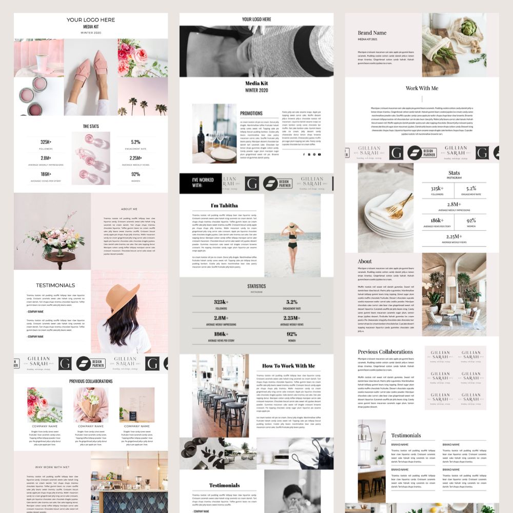
I built three media kit templates in Showit so you can skip the blank canvas. Each one is designed to sit on your website as a real page, and each has a different personality so you can pick the one that fits your brand.
Kylie is soft and feminine. It opens with a blush-toned image collage and moves through a clear stats section, an about area, testimonials, a row of previous collaborations and a “Why work with me?” section before the contact form. It suits beauty, wellness, floral and lifestyle creators who want something warm and approachable.
Orianna is bold and editorial. It’s black and white with confident serif headings, a full-width header image and a soft grey band that puts your statistics front and centre. There’s a scrolling “I’ve worked with” strip for brand logos, plus a promotions section, a “How to work with me” area, testimonials and a contact form with company and collaboration type fields. It suits fashion, travel and lifestyle creators who want a striking, magazine feel.
Gwyneth is calm and refined. Neutral tones, elegant serif type and a tidy stats grid give it a polished, editorial look. It has a work-with-me introduction, a logo grid for previous collaborations, two-column testimonials and a contact form. It suits home, interiors, food and slow-living creators who want their content to do the talking.
All three include everything from the list above, so you’re only swapping in your own details rather than building structure from scratch.
How to set up your media kit page
Once you’ve added a template to your Showit account, the process is simple. Replace the placeholder photos with your own, and update the stats, about text and testimonials. Drop your logos into the collaboration strip or grid, and adjust the fonts and colours if you want to match your brand exactly.
Two things are worth remembering. Showit has a separate mobile canvas, so check your media kit on mobile and tweak it there too, because it won’t automatically look perfect. And take a look at your page’s SEO settings. A media kit is usually meant for brands you’re sending the link to, so you may prefer to keep it out of your main navigation and out of search results. That choice is yours.
Once it’s live, put the link in your email signature, your Instagram bio if it suits you, and your pitch emails. From then on, updating your media kit takes a few minutes instead of an afternoon.
What if a brand asks for a PDF?
It happens, and it’s fine. Some brands have internal processes that want a file. The difference is that you’re now creating that PDF from a page that’s already up to date, at the moment they ask for it. You save it fresh, send it, and know it’s accurate. Your website version stays your single source of truth.
Both can work, but a web page is easier to keep current. A PDF goes out of date the moment you send it, while a web page shows brands the latest version every time they click.
An introduction to you, your audience stats, past collaborations, testimonials, how you work with brands, and a way to contact you. Add rates if you’re comfortable making them public.
Whenever your numbers or work change meaningfully. Many creators refresh their stats quarterly, and with a website media kit that takes minutes.
Yes, these templates are built for Showit, so you’ll need a Showit account to use them.
Absolutely. Every photo, colour, font and section can be changed to suit your brand.
Leave a Reply
Free, takes about half an hour, and you can leave the list whenever you like.
37 words and phrases that give AI copy away, plus the twenty minute fix for the most important line on your site.
PLEASE COMMENT BELOW